| Build-A-Board®: for Windows; The Next Generation of Onscreen Keyboards; Version 2.20 Release 5; User's Guide | ||
|---|---|---|
| Prev | Next | |

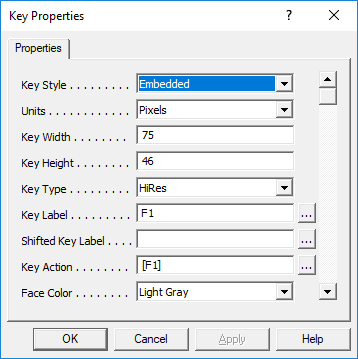
The following lists each available Key Property. Important notes & limitations for the Key Properties may only be included here.
Key Style
Currently the only Key Style in Build-A-Board is Embedded.
Units
Currently all measurements in Build-A-Board is in Pixels.
Key Width, Key Height
This specifies the Key Width & Key Height in Units.
Key Type
Supported types are Simple, Regular, & HiRes.
Simple will only convert the displayed Key Label into a Keystroke.
Regular can handle different actions, separate from the Key Label
HiRes uses a high-resolution background for a "Regular" key. HiRes is also required for Key Images / key backgrounds.
The Caps Aware identifier has been used in custom versions, and will be part of the Caps Lock solution. It is currently unused.
Key Label
This can be up to 63 characters long.
Built-In (Internal) Images
There is an override lable {IMG:*} that will display alternate images. Currently supported images (drawn via internally handled low-level graphic calls) are:
Label Image
{IMG:MIN} Minimize (Windows) bar
{IMG:A_UP} Up Arrow
{IMG:A_DN} Down Arrow
{IMG:A_LT} Left Arrow
{IMG:A_RT} Right Arrow
{IMG:A_DUP} Double Up Arrow
{IMG:A_DDN} Double Down Arrow
{IMG:A_DLT} Double Left Arrow
{IMG:A_DRT} Double Right Arrow
{IMG:BOXFL} Box, Filled
{IMG:BOXOP} Box, Open
{IMG:BOXUL} Box, Upper Left (Filled)
{IMG:BOXUR} Box, Upper Right (Filled)
{IMG:BOXLL} Box, Lower Left (Filled)
{IMG:BOXLR} Box, Lower Right (Filled)

External Images
When images are placed on Keys, the syntax used is {IMG:@ccccccc:nnnnn}, where the cccccc is a character based file name identifier, and the nnnnn is a 5 digit, 0 based image number (i.e. 00000, 00001, 00002, etc.). The actual number is internally calculated during a save/build, so the number after the : should not be modified. The name, e.g. {IMG:@somepic:00001} means there is an IMGsomepic.BMP in the Source folder, that will be converted to a sized PNG, assigned an ID number, and then included in the KBF. While this could be done manually, it is recommended you simply use the "Place Image File" option, available in the right-click Key menu, or via the "..." option next to the Key Label. When selected, a system File Open dialog will be displayed at the Pictures location for the current user. When an image is selected (or dragged to the key via Windows Explorer), the file will be converted to a Bitmap, properly named, placed in the source folder, and the Key label will be automatically updated based on the above structure.
Panel Image Notes: In 2.20, the background panel image requires an existing key image (and referenced within the MYTSOFT.INI, edited via the Window Properties Edit Keyboard Run-Time Settings). See notes in the file itself. For best results, the image should be placed by dragging an image onto the panel - this will create a key off-board (to the right) at the same size as the panel, and then tag the MYTSOFT.INI with the image number. If necessary, resize the board (without resizing keys) to see this key container of the panel image. Note that this is a temporary work-around approach to the panel image for the 2.20 release, since only keys can arbitrarily carry image files in this release.
Shifted Key Label
This is the image that will be displayed on the Key when the Shift state is triggered via a Key with a [Shift-Down] Action. If the Shifted Key Label is blank, the regular Key Label will remain when in the Shifted state. Also 63 characters long.
Key Action
For Regular (& HiRes) keys, this is the Macro command to generate Keystrokes. It can be up to 127 characters long. There is the Build-A-Board Macro Builder available by clicking on the Build button (...). - See Key Actions for commands.
Face Color, Text Color, Highlight Color, Shadow Color
There are 16 basic colors, and then the option to use custom colors for each element (24-bit color (8-bit Red, 8-bit Green, 8-bit Blue)).

Frame Type
You can select None (no frame at all (all background), Standard (single pixel), and Thick (double pixel).
Font Face Name, Font Width, Font Height, Font Weight, Font Style
These are the font characteristics that define a Font per key - it is recommended you use the "..." button to use the Font dialog to easily select the font you wish, which will fill in these values - please be aware font support on the Run-Time target may be limited - see Fonts.

Custom Face Color, Custom Text Color, Custom Highlight Color, Custom Shadow Color
When set, these are override colors to the basic Face Color, Text Color, etc. 0 means no custom color is in use. Values 1-15 are reserved for the basic colors. The representation is decimal, but the internal value is an RGB value of 0x00xxxxxx, where the RGB values are 0x00BBGGRR.
Hover Action, Hover Color
If Hover Action is None, the key will is normal. If Hover Action is Highlight, the background will change to the Hover Color when the mouse pointer (Mouse Over) is over the key. This only affects Regular keys with color backgrounds - HiRes keys and image labels do not highlight.
Key Press Highlight, Key Press Color
In Version 2.20 Release 5 this feature to highlight a key press is not enabled.
As seen in ...
